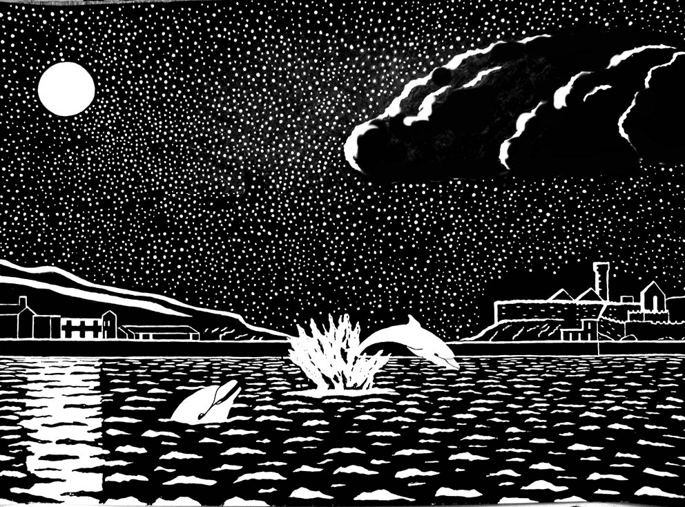
The moon… the water… the dolphins

PETER: It ended up a bit like a children’s book illustration, so I just went with it.
JM: Well, the atmosphere is all there, the dolphins are great and I imagine it will be warmly appreciated.
I do have a couple of points, for what they are worth.
The clouds do look a bit ‘children’s illustration’. I think this is because they are outlined and have become a bit flat. If you break up that white outline and ‘sculpt’ the clouds a bit by thickening the parts where the moon reflects most…

…then the clouds lose the children’s illustration naiivity and at the same time better reflect the prevailing atmosphere. And the base of the clouds (which would not reflect the moon) is now nicely implied by the lack of stars.
I wonder about the flying birds. I am not against them, but positioned as they are they seem to me to take away from the starry expanse… I’ve taken them out (below) so you can compare…

I am concerned about the way the composition divides in two. On this occasion I think having the dynamic focus (the splash) in the centre works a treat. It is helped by the rhythmic curves of the dolphin. But I wish the position of the clouds didn’t divide the sky in two.
Stretching the clouds out towards the moon a bit would, I suggest, not only create a better division, but also a nice counter-rhythm to the dolphins:

And you might notice I brought the birds back on the far right. Now the eye can move from the dolphins to the castle, up to the birds and be pulled back by the clouds to the moon. Then slide down the moon’s reflection into the water and back to the dolphins.
I hope I haven’t highjacked the picture after you did all the hard work. Composition requires deciding between alternatives: Photoshop makes this sort of speculation very easy. But you have every right to ignore my suggestions!


Thanks John, excellent feedback. I agree with all those amendments. I like the birds against the dark clouds.
What I’ve found is that this stripped down style really shows up any flaws in composition or inconsistencies of technique.
It looks very simple, but you really have to get it right because there’s not much to hide behind.
In many ways I find this simple style more challenging than more realistic styles, where there’s plenty of shading etc… to hide behind. I do like exploring the possibilities of pure black and white though.
Thanks. Peter