Peter’s dolphin moonscape

PETER: I have joined the Manx Whale and Dolphin trust. Always had a fascination with anything marine. Even had a brief spell studying Marine Biology.
https://www.mwdw.net/
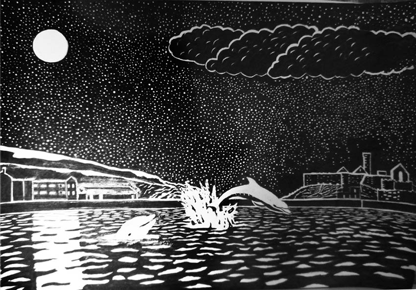
I want to do a picture to donate to them, probably based on a pair of dolphins (mother and calf) that have set up residence in a bay on the Island this summer. I was thinking black and white. I’ve been quite taken by Rockwell Kent’s illustrations for Moby Dick. I’d like to do my picture in a similar style. Not a complete copy, but inspired by Rockwell Kent.
This draft has some issues I need advice on. For one I think the castle on the right needs to be bigger because there’s a monotony of horizontals. What do you reckon John?
Please ignore the crudeness of some of the forms, this is a draft, and will be refined in later versions.
DAVID: I like it because the dolphin is jumping through the horizontals and distracts from them
JM: Monotony is the wrong word. What Horizontals give is an atmosphere of calmness and, as David says, the rhythms and diagonals of the dolphins disrupt the calmness.
Still night: sudden leap and splash! is the message.
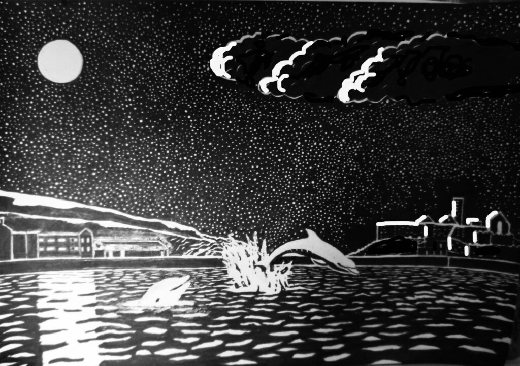
If the castle were bigger it would seem nearer, and challenge the dolphin – neither of which seems a good idea to me. I like the distance of the far shore. The ripples work very well in creating that distance, but then some of the texture details on the castle actually bring it nearer again. – In fact there could be less detail altogether in those buildings, instead making more of the light on the moonlit edges.
The ripples, the moon and its reflection, coupled with the underlying blackness (as if it was scratchboard, though I know it was actually white paper) make for the strong atmosphere which will be a real feature of the finished picture. However I do think the way you draw the clouds is out of keeping, a bit flat chidren’s-illustration style, and not making the most of the atmospheric potential of the moonlight.
How about emphasising only the moonlit edges of the clouds and letting them fade to black on the shadow side. I’ve done some crude photoshopping here to show what I mean:

PETER: I agree about the clouds, they looked very clumsy, out of keeping the way I drew them, I’ve not quite figured a style to do moonlit clouds, but your idea works well. Yes the castle was a problem, if it’s bigger it looks too near. Increase the highlights, that’s a good idea.
JM: Very promising subject, and I am confident it will make a good gift.
Bearing in mind it is a gift, you might need to actively avoid tippex on the final pic. It always yellows over the years. Doesn’t matter when a drawing is done for reproduction, of course.
If you resolve the various doubts at the rough stages, you should be able to commit with confidence in the final pic, and not need tippex.

