

Still life set-ups
Setting up a still life is a significant part of the process of actually doing a still life. So I wanted people to take their time selecting two or three objects, arranging them against a background, adjusting lighting and settling the best angle of view.
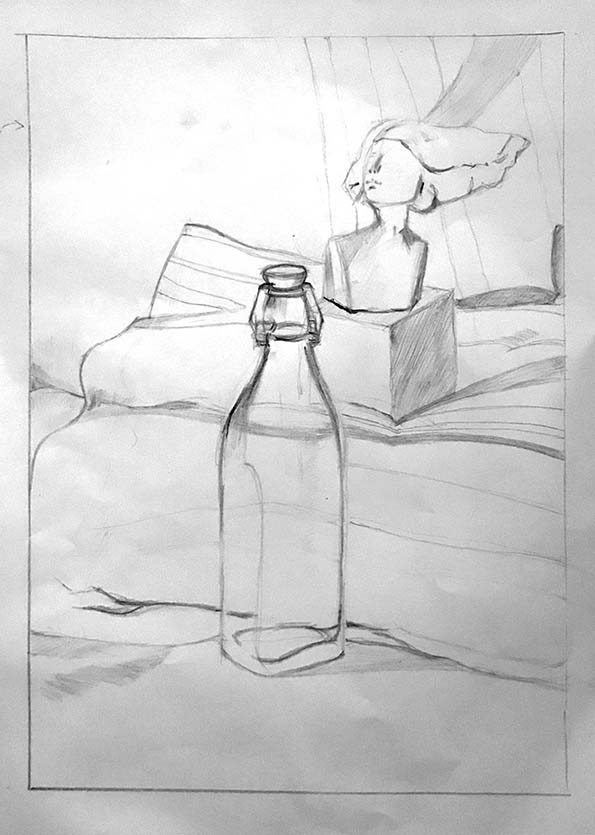
It is interesting that out of all the bric-a-brac I offered as subject matter, two people went for Christy Keeney sculptures. Roger (above) arranged a Keeney bust next to an empty bottle – a nice contrast – against a background of yellow and blue cloths. . The bottle is challenging because halfway up it changes from square to circular shape.
There are some good rhythms in this composition, and it was worth using a card window frame to help visualise the shape of the final picture plane.
This seems ready to become a painting, and Roger is thinking of oils.

Kathy placed her Keeney sculpture dead-centre and the candlestick to the left-hand side. This was saved from being unbalanced by folds in the red cloth background, and by the fact that the horse’s head was looking right. In fact there’s a rather satisfying ‘pull’ in the composition.
I do think it’s not helpful to draw your main object first and only consider the background as an afterthought. A background added later can so often compromise the tones, hues and luminosity of the object you’ve already painted.
And indeed, after receiving these words of wisdom from me,Kathy turned full attention to the background. Now she can return to the horse figure and paint it with the right attention to the levels of tone and light in context with a rather assertive backcloth.

David chose a good coupling of delicate garlic and granitic pestle’n’mortar. Nice attention to ellipses, shadows and tonal rendering. But how accurate is the judgement of the form? Here’s that pesky pestle and its mortifying mortar:

Here’s three consecutive paintings of Jane’s set-up: Her improvisatory approach would seem to spawn endless versions, no two the same, and it seems a matter of chance which version works out. Others might repeat in order to refine, but this is the approach that seems to work best for Jane.


I feel Julie (below) could have spent longer on her set-up. Particularly the placement of the vessels in relation to each other. There is an uncomfortable clash of edges here between pepperpot and vase.
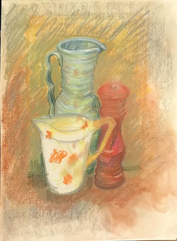

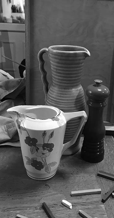
The second issue is tonal contrast. It’s not an easy thing to judge: contrast in colours might mask sameness in tone, and it might be helpful to take a photo and turn it into mono in order to judge:

With a still life you have full control of these elements, and it’s worthwhile taking time to get it right before you make your first marks.