
Composing with negative shapes 1: Esther, Chris and Nina
Maria gave us a number of 7–10 minute poses. The idea was to define the figure by its surround, to see and depict the ‘negative’ spaces around and withing a pose.
When some people asked if they should be outlining the figure before filling in negative spaces, I didn’t give a definite answer as I felt that was up to individual stylistic preference. But I wish I had sold the idea of not drawing a contoured outline. I think that those, like Esther, who naturally created blocks of tone rather than lines, found it easier.
Allowing the background to reveal the object as a shape on untouched white paper is the ultimate object here.

A common shortcoming of many of these drawings is that the negative shapes peter out like a vignette, so that they are more like a fringe than a set of shapes. and I blame myself for perhaps not stressing it enough or, indeed, giving a bit more time for filling in space.


It helps a lot whenever the drawing is in a simple border so that the negative and positive areas can be arranged into a composition.

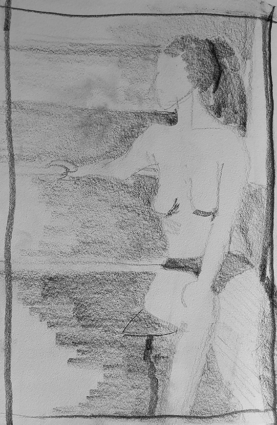
Chris has avoided outline altogether here, but didn’t make much of the actual negative shapes.
Applying a border is part of this, as in most cases it completes the definition of the negative shape. Here’s Chris’s drawing after Photoshop had had its way with it, adding a border and filling in the negative shapes.

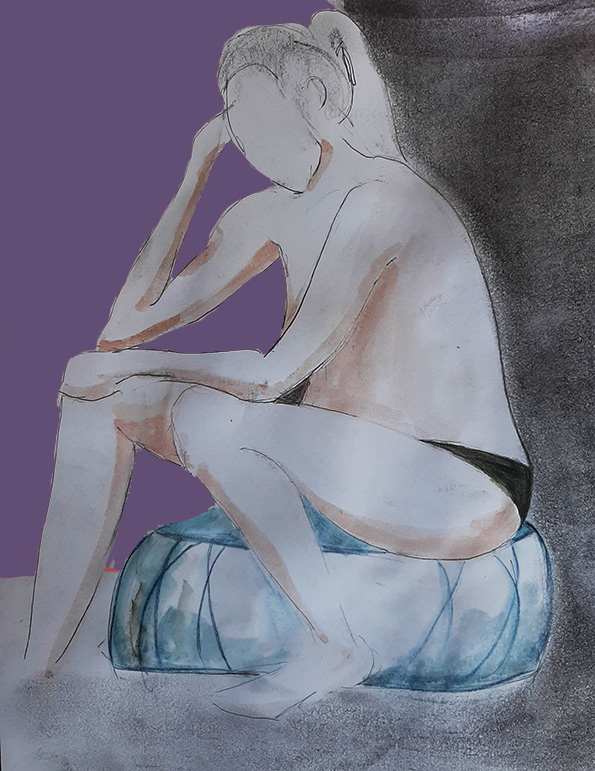
With its border defined, this drawing (below) by Esther seems well on the way to being a very satisfying composition.


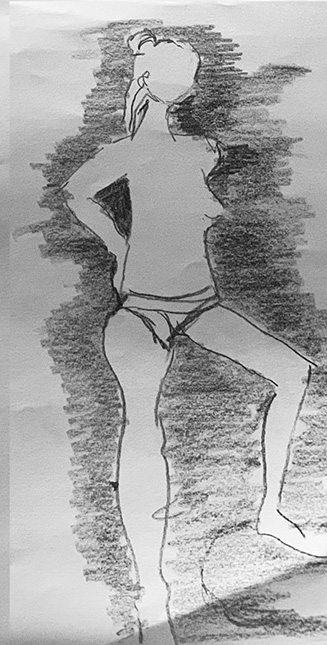
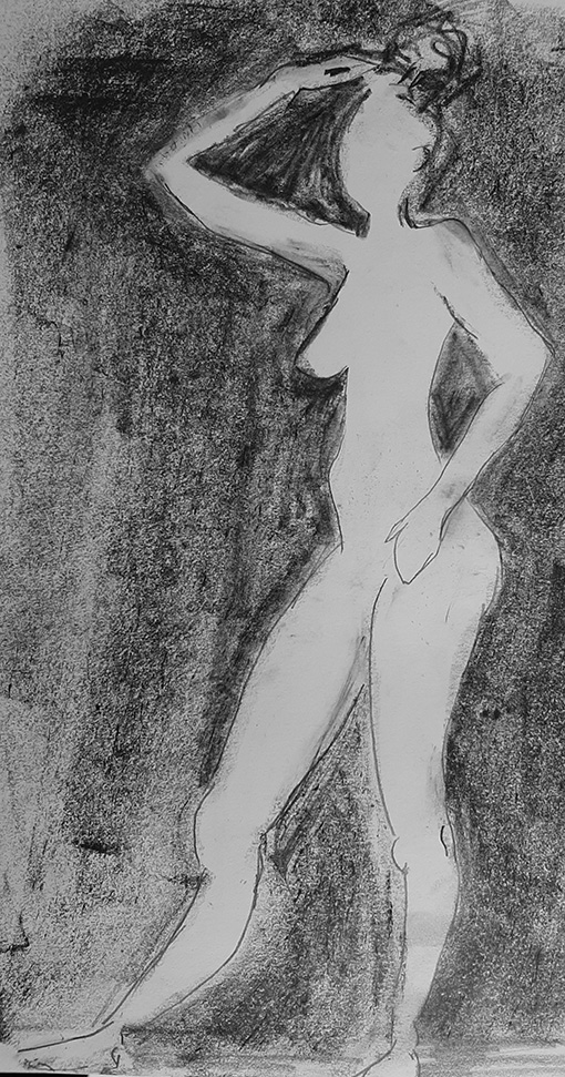
Nina (below) made a very nice line drawing, but it’s clear that the negative area on the right is an added afterthought.
In fact, adding the negative areas on the left side (I’ve done it below in Photoshop) really enriches the portrayal of the figure and strengthens the composition.