

Black and white composition
I’ve always loved black and white – in fact I didn’t get a colour tv until I found my kids were ashamed to invite friends back because of our little b&w set.
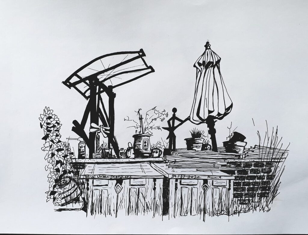
So naturally I am getting a lot of pleasure from Steve’s increasing mastery of the black and white medium. This drawing has got bags of detail and much variety in the markmaking.
The only quibble I have is about composition. I feel it doesn’t hold together; it actually seems to be splitting in two in the middle.

The reason is that the two main features are of equal importance (competing) and – worse – equal height. In fact, though it’s full of interesting objects, too many seem to be the same height as each other. the whole picture splits into several horizontal segments because of lack of variation in the heights:
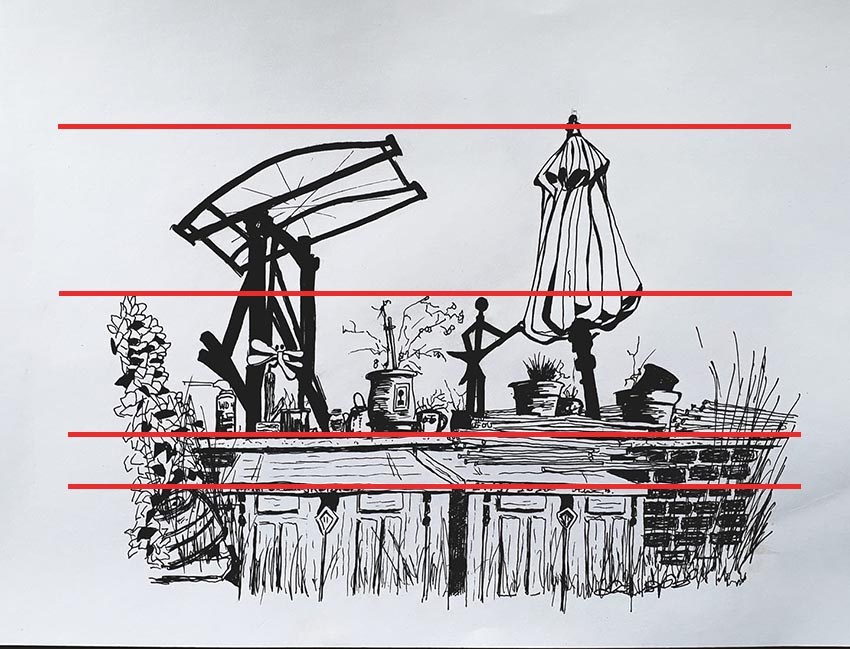
Parallel horizontals are deadening: they can take rhythm out of a picture.
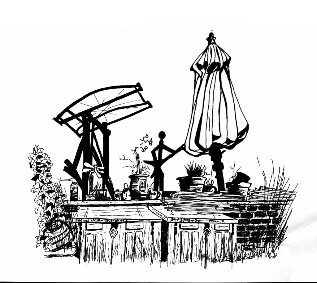
So… I took the liberty of adjusting the picture, making the sunshade the main feature. The top of it now becomes the focal point, the apex of a triangle. And the silhouetted machinery now serves the sunshade with its angles leading the eye. So (I suggest) the picture gains life, rhythm and integration.
You might argue, oh it’s just a sketch. But, thanks to the technical polish, it is better than that. Even in basic sketching I think we should be making compositional decisions right from the start: select a focus, decide on a hierarchy of shapes, and see how lines – especially diagonals – can lead the eye around the picture, and create rhythm.
Thanks John, I appreciate the excellent feedback.
Amazing how much difference making the sunshade the main feature does. The eye can float around the image much more easily. Good work Steve and John.