

Lockdown with Ravilious

I wish my seven days’ isolation in the attic back in March had resulted in something of this quality! Ravilious is an inspiration for anyone dealing with everyday subject-matter.
Ravilious died (lost in action as a war artist) in 1943, aged just 39. (The older I get, the more people I discover died young.) He was both fine artist and illustrator, which appeals to me of course.
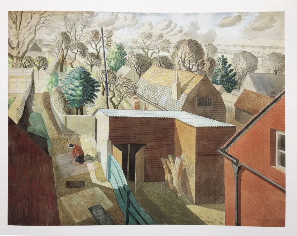
Like a lot of prolific artists, he did poor stuff in amongst the good stuff. At his best, he really draws you into a picture. So for us, it’s worth seeing how he does this, using composition, creating rhythms and depth.
The other thing I like about his work is a kind of translucence in the watercolour, the ways he allows the white of the paper to shine through the brushwork.
The light in that attic is astounding, but the camp bed looks uncomfortable.
He’s very skilled with the effects of light, shadow, shade which I’m guessing he exaggerated to increase depth. He seems fascinated with the effects of light and shadow.
It would be interesting to see these colour Ravilious in greyscale. I think they’d work well.
He’s arranging lighted objects, next to shaded objects to good effect – which of course is the basis of black and white illustration.
Then he’s simplifying objects, but there’s still a meticulous, stylised detail.
Maybe simplifying objects allows him to really bring out the effects of light and shadow without getting to bogged down in surface textures.